Top 13 Best SharePoint Site Examples [Copy Them With 1 Click]
![Top 13 Best SharePoint Site Examples [Copy Them With 1 Click]](https://foyercus.blob.core.windows.net/287a2408185e68c371c/blog/299/c/f89f9d5e-c1e6-402a-8f38-e0036e14e5e6.jpg)
![Top 13 Best SharePoint Site Examples [Copy Them With 1 Click]](https://foyercus.blob.core.windows.net/287a2408185e68c371c/blog/299/c/f89f9d5e-c1e6-402a-8f38-e0036e14e5e6.jpg)
Need some inspiration for your SharePoint website?
Or better yet, are you looking for SharePoint template sites that you can copy in one click?
In this post, I'll go over the 13 best SharePoint site examples from Microsoft's lookbook that you can use just by clicking one button. Each example will come with a link to a page where you can click "Add to your tenant" to quickly create your own intranet site.
Let's get right into it!
SharePoint Site Example #1: Leadership Connection
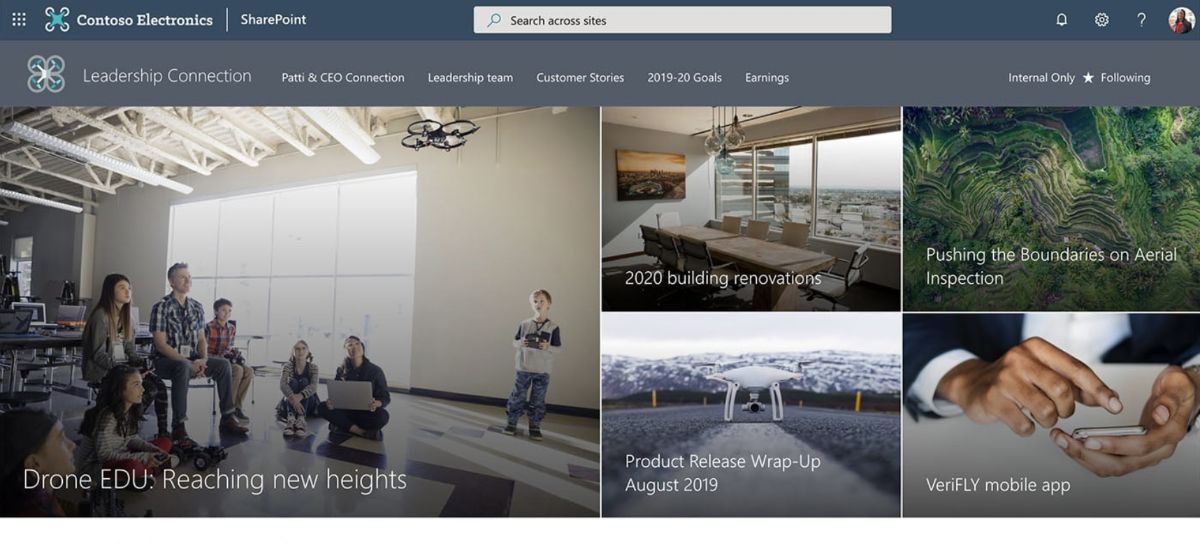
This Leadership Connection site is tailored for showcasing leadership news, events, and fostering engagement among team members. It serves as a centralized platform to communicate the leadership team's goals and priorities, encouraging participation through events and conversations. The site is designed with a custom company theme, incorporating a section background and a compact header with a header background to match. It features a mega menu for easy navigation and is configured as an organizational news source to keep everyone informed.
This SharePoint template includes a variety of web parts. A Hero web part with full width and 5 tiles, another Hero layer with 2 layers, Hub news for the latest updates, a Stream web part for single video presentations, and a Quick Links section with descriptive icons. The Yammer web part integrates conversations, while the Events section presents information compactly. Text customization is made possible with custom RTE formatting.
Upon adding this design to your tenant, it generates an example welcome page that utilizes out-of-the-box web parts and example news articles to showcase different modern page designs. This template requires tenant administrator rights for deployment and meets specific system requirements to ensure compatibility and performance.
SharePoint Site Example #2: Fly Safe Conference
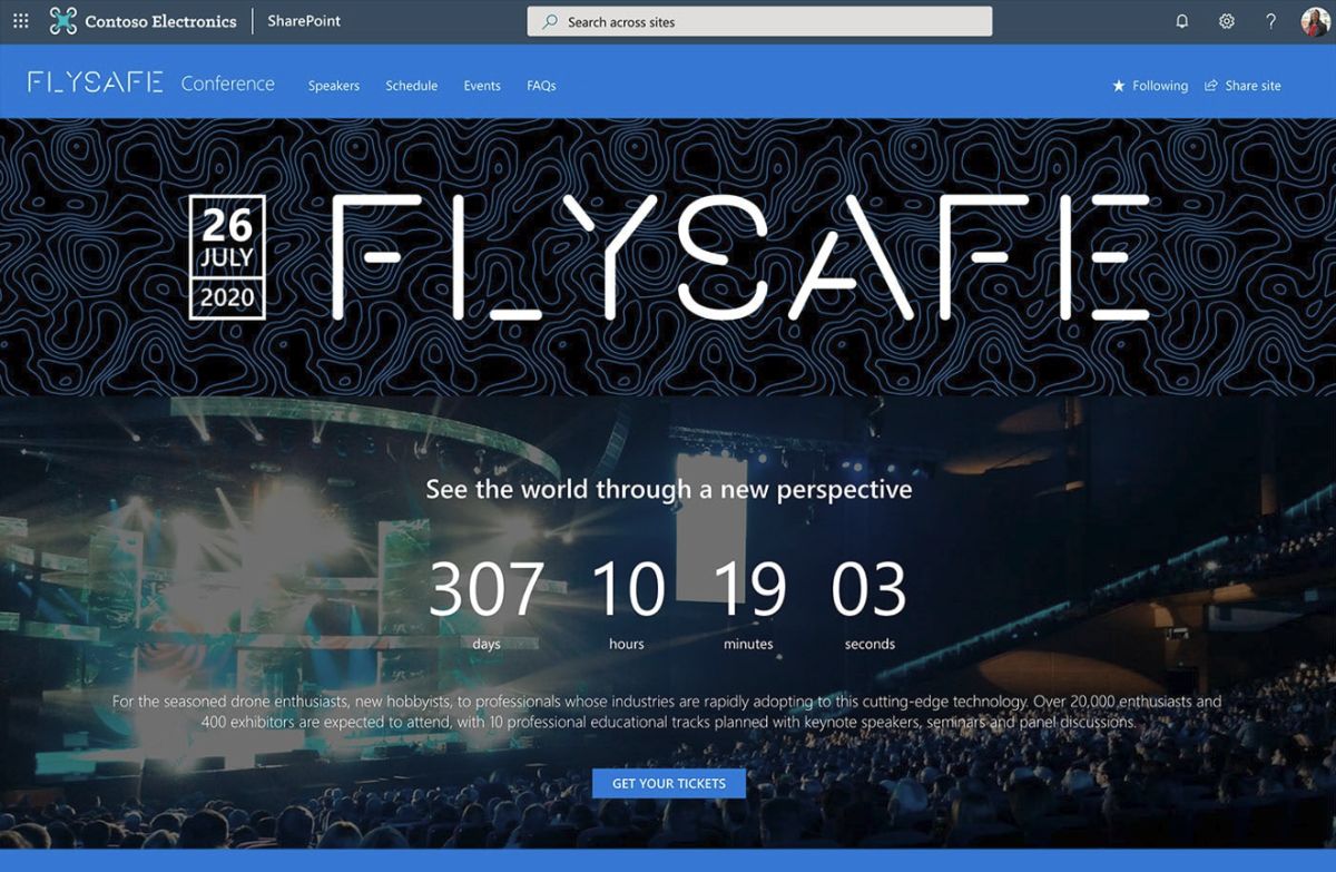
The Fly Safe Conference site is designed to captivate and engage audiences with a focus on event promotion, featuring a highly visual layout complete with a countdown timer and striking images. It's the perfect platform for generating excitement about upcoming events. The site incorporates a custom company theme, enriched with a vertical section and section background, alongside a compact header with a custom header background to enhance the site's visual appeal. Navigation is simplified with a mega menu, and the site's identity is solidified with a custom site logo and footer.
For interaction, the template includes several web parts: a full-width Image part for showcasing prominent visuals, a full-width Countdown timer to build anticipation for events, and a Hero web part with 2 tiles for highlighting key information. The Events section uses a filmstrip layout for a presentation of upcoming activities. Text web parts support custom RTE formatting, including the use of emojis as icons for a more engaging user experience. Additionally, a Button web part is included for clear call-to-actions.
By implementing this design, a custom welcome page is created, utilizing out-of-the-box web parts to offer a unique and engaging entry point for visitors. This template is ideal for organizations looking to promote events with a visually appealing and interactive online presence.
SharePoint Site Example #3: Collaboration Team Site
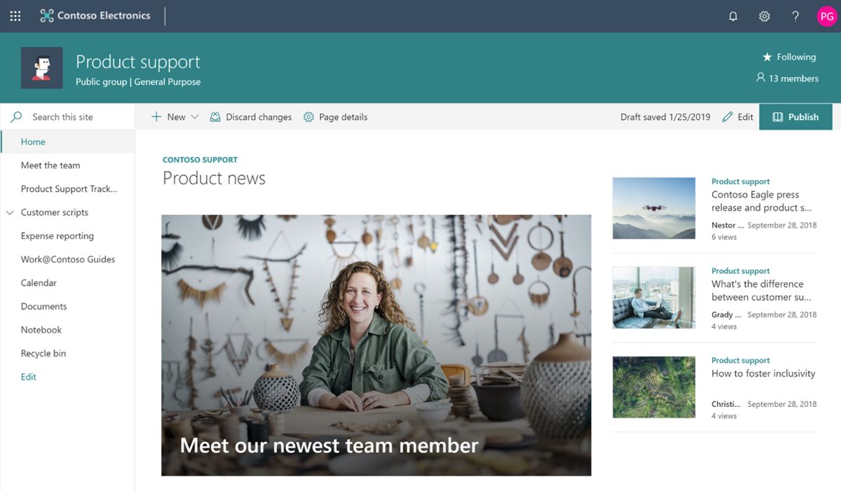
The Collaboration Team Site template is ideal for managing announcements, news, and collaborative efforts within teams. It integrates various components such as news updates, file sharing, and a team calendar to support efficient teamwork.
By creating a custom company theme, the site structure benefits from a vertical section and a section background, enhancing its visual appeal. Navigation is facilitated through a mega menu, while the compact header and custom header background contribute to the site's professional look. The identity of the team or company is further emphasized with a custom site logo and a footer.
For dynamic content display and interaction, the site utilizes several web parts. The News web part offers different layouts like Carousel, Side-by-Side, and List for diverse news presentation. Quick Links are displayed in a filmstrip layout for easy access to important resources, and social interaction is encouraged through Twitter and Yammer Conversations web parts. The template also includes an Image web part with text overlay, a Countdown timer, Weather updates, a World clock, Recent documents, and a compact Sites list. Highlighted content is showcased in a grid layout for an engaging user experience.
Upon integrating this design into your SharePoint environment, a new site collection is created with a group-associated team site template, which can also be applied atop an existing site. This addition includes a custom welcome page, two additional content pages, and three news articles with example content. The Documents library is enhanced with a custom content type and an additional document library, accompanied by sample Word, PowerPoint, and Excel files related to the site's theme. Sample image content used within the template further enriches the site's visual aspect, making it a comprehensive solution for team collaboration needs.
SharePoint Site Example #4: Benefits Site
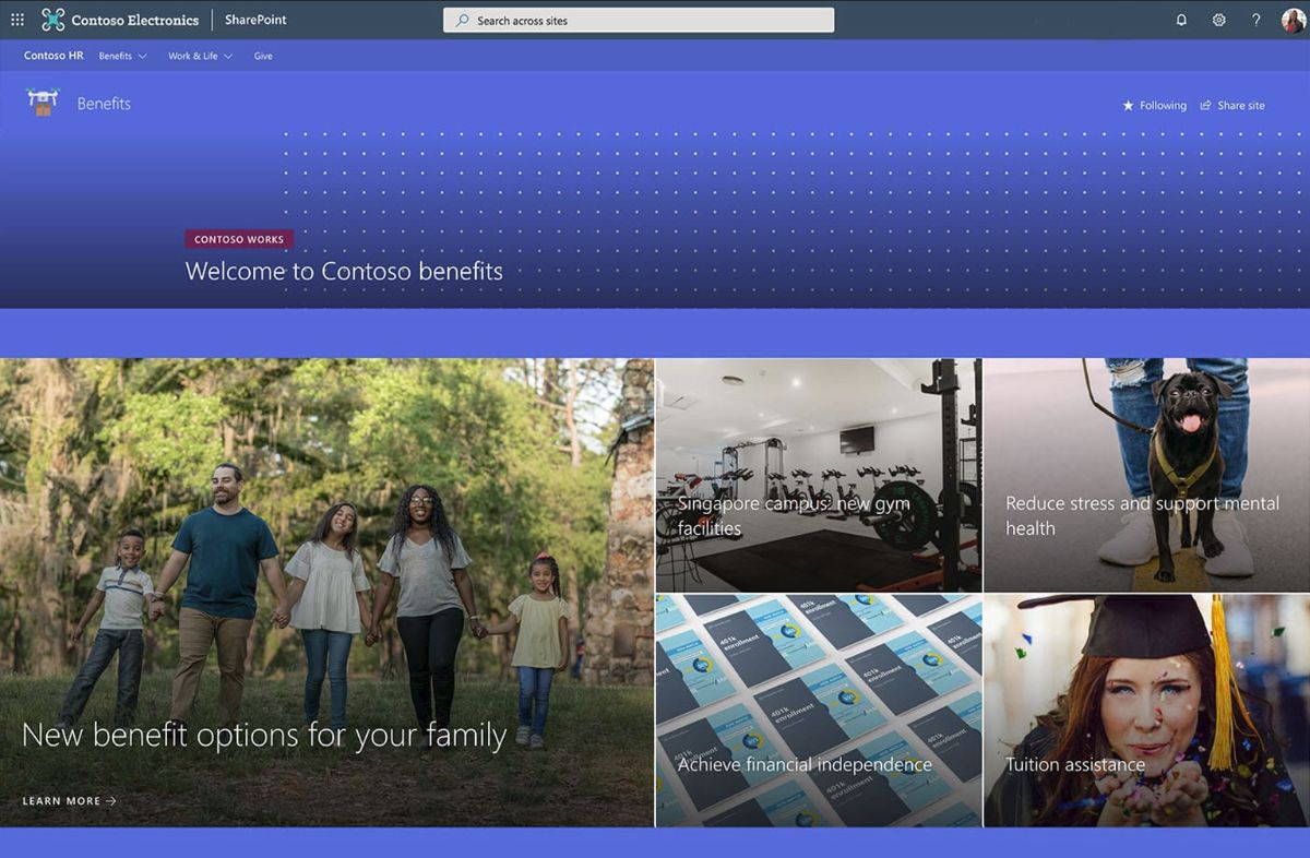 The Benefits Site intranet site example centralizes all essential information employees require to understand and access their benefits, encompassing top tasks and events. It uses a custom company theme with a vertical section and section background, alongside a compact header enriched with a header background for visual appeal. The navigation uses a mega menu, and the site's brand is clear with a custom site logo and footer.
The template is equipped with various web parts to facilitate content presentation and user interaction. A Spacer web part is utilized for layout organization, while two Hero web parts - one full width with 5 tiles and another layer with 2 layers - are used to spotlight key information and resources. Quick Links web parts are presented in two formats: a list without icons for straightforward access and a filmstrip for engaging visual navigation. The Events and People web parts are set in a filmstrip and compact layout, respectively, to showcase upcoming events and highlight key personnel effectively.
Content creation with this design includes a custom welcome page built using out-of-the-box web parts, ensuring a tailored entry point for users. Additionally, the template provisions for 2 articles and 4 news articles with example content, alongside example Office documents and lists, enriching the site with valuable resources and information. This comprehensive approach ensures employees have immediate access to benefits information, streamlining their experience and enhancing their engagement with the site.
This template is great if you're trying to make a benefits site using SharePoint.
SharePoint Site Example #5: School Home Page
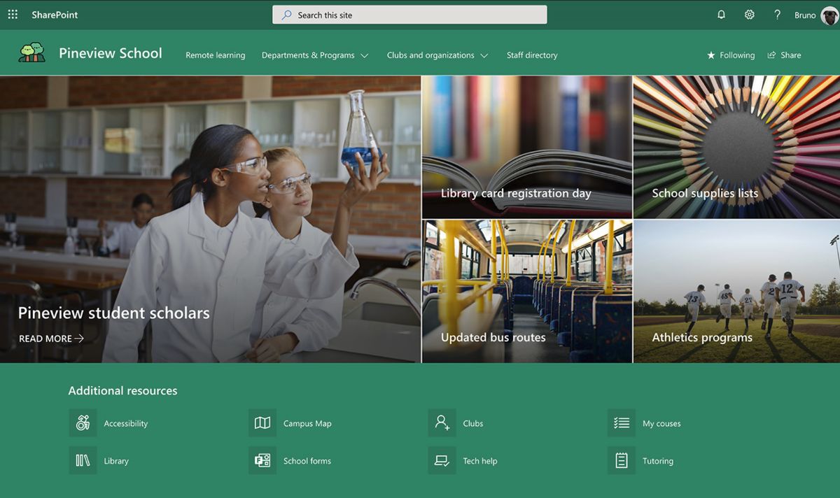
This School Home Page SharePoint template can be used to create a central hub for school-wide communication, catering specifically to the needs of students and teachers. It consolidates important resources, upcoming events, and the latest news, making it an essential tool for the entire school community.
This template uses a custom theme that reflects the school's identity, enhanced with a section background and a header background to create a welcoming and cohesive look. Navigation is streamlined through a mega menu, and the site's branding is reinforced with a custom site logo and a cohesive footer.
Key features include a variety of web parts designed to improve the user experience and ensure important information is front and center. A Hero web part with full width and 5 tiles showcases major announcements or events. Quick Links are presented in a compact layout for easy access to essential resources. The Image and Text web parts allow for the integration of visual elements alongside informative content, while a left-aligned Button web part encourages user engagement with calls to action. News and Events are highlighted in side-by-side and film strip layouts, respectively, each capable of displaying 4 items, ensuring that the latest updates and upcoming events are prominently featured.
Upon integrating this design into your SharePoint, it automatically generates an example welcome page utilizing out-of-the-box web parts, along with example news articles and pages to demonstrate the versatility of modern page designs. This template is not only a practical solution for schools looking to foster a sense of community and keep their population informed but can also serve as a model for other educational institutions seeking to enhance their digital presence.
SharePoint Site Example #6: New Employee Onboarding Site
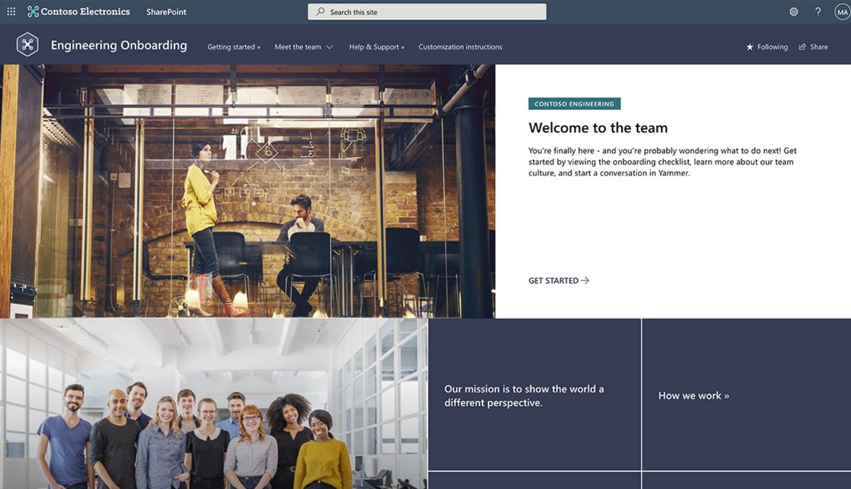 The New Employee Departmental Onboarding Site is designed to help new hires integrate into their specific department or region. It aims to connect them with their teams, share important departmental announcements and news, and welcome them to the organization. This site fosters community and culture within workgroups and can be customized to meet the unique needs of your organization.
The site features include a custom company theme, vertical section, compact header, and custom site logo, all set against a designed section and header background. The footer rounds off the site's structured design.
Web parts utilized in this template are diverse, including a Hero section for major announcements or welcome messages, Text for detailed descriptions or messages with custom RTE formatting, and Image web parts for visual engagement. The Call to action, Quick Links, and People web parts direct new hires to essential resources, while YouTube, List, World Clock, and Bing maps web parts provide additional useful information. The Sites web part in a compact layout helps new hires navigate through the organization's digital environment more efficiently.
Upon adding this design to your tenant, it automatically creates a custom and pre-populated home page, along with pages that introduce new hires to the company's mission, culture, and leadership. It includes a new employee checklist built on Microsoft Lists, example content for various web parts, a pre-written new employee FAQs page, and recommendations for creating a social and engaging experience for new hires. This template is an effective tool for departments looking to streamline the onboarding process and ensure new employees feel connected and informed from day one.
SharePoint Site Example #7: Human Resources Hub
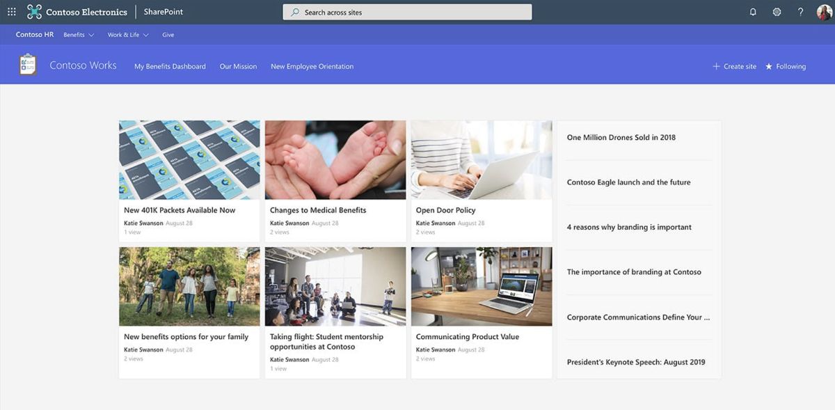 The Human Resources Hub is a SharePoint site designed to centralize employee-focused news, resources, and tools like a custom PowerApp for time off requests. It simplifies access to hub news, events, contacts, and other essential HR resources.
This site uses a custom company theme with a vertical section and a section background for a unified look. Navigation is enhanced with a mega menu, and the site features a compact header with a background that matches the custom site logo and footer for a cohesive design.
Key web parts include Hub News with options for carousel, side-by-side, and list displays; a File viewer with custom slide start for document sharing; and a compact Events section. A Hero web part with one tile highlights major announcements or resources. Quick Links are made accessible through a button with an icon on the left, outline, center alignment, and one-line title text, as well as a list format with descriptions and icons on the left for easy navigation. A custom PowerApps web part is included for specialized functions such as time off requests. The People web part in a compact layout facilitates easy access to HR contacts.
By adding this design to your SharePoint tenant, it will create a hub site with custom content, a secondary site collection linked to the hub, multiple custom modern pages, news articles, and example Office documents to support HR activities and communications.
SharePoint Site Example #8: Product Support Site
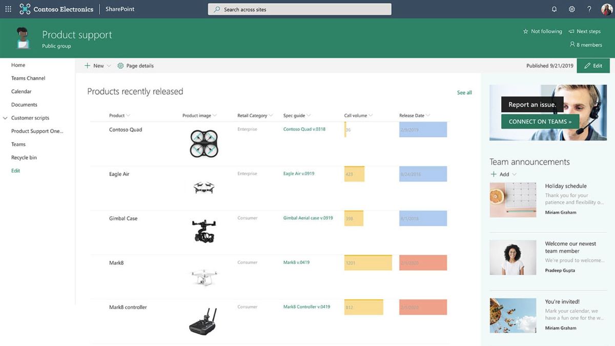 The Product Support site example is designed for employees in the retail sector, offering a centralized location for announcements, product information, news, and training resources. This team site aims to support front-line employees by providing essential updates and resources for their roles.
The site features a custom company theme with a vertical section and section background, enhancing the visual appeal and organization of content. Navigation is made straightforward with a mega menu, and the site's identity is reinforced through a compact header with a background that complements the custom site logo and footer.
Included web parts are a List with custom formatting for easy access to information, Highlighted Content in a filmstrip layout for featured items, and a Quick Chart web part displaying data in a column chart format. A Call to Action web part encourages employee engagement with specific tasks or resources. News is presented in a side-by-side layout for current updates, and a Group Calendar web part helps in tracking important dates and events.
Upon integrating this design into your SharePoint, a custom welcome page is created using out-of-the-box web parts, alongside a custom list with a view formatting definition, and sample images and Office documents. This setup ensures employees have access to critical support resources and information in a well-organized and visually appealing environment.
SharePoint Site Example #9: News Site
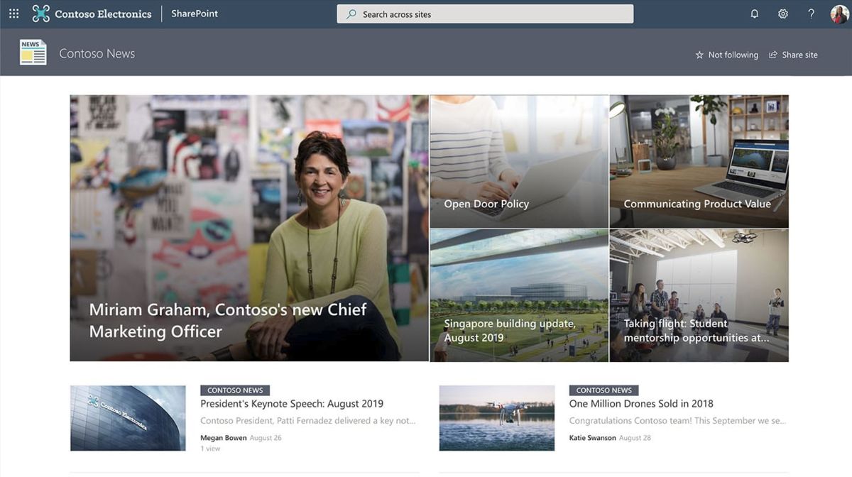
The News Site is tailored for disseminating company and organization news, leveraging multiple news sources and layouts to showcase stories and events from across all levels of the company's organizations. It functions as a comprehensive communication site that keeps employees updated and engaged.
Configured as an organizational news source, the site features a custom company theme that aligns with the company's branding. The design includes a section background and a compact header with a header background to create a cohesive and professional appearance. The custom site logo and footer further personalize the site, making it instantly recognizable to employees.
To display content effectively, the site employs a variety of web parts. The News web part comes in multiple formats: Tiles, Side-by-side, Hub News, List, and Carousel, offering flexibility in how stories are presented. Text web parts allow for custom RTE formatting, enabling the creation of visually engaging content. Quick Links and Events are showcased in a filmstrip layout, facilitating easy access to important resources and upcoming events. An Image web part, alongside a left-aligned Button, enhances user interaction. The Hero web part is used in two configurations: one layer and full width with 2 tiles, highlighting key content and announcements prominently.
Upon adding this design to your SharePoint tenant, a custom welcome page is generated, showcasing the capabilities of different web parts. Additionally, 16 modern pages are created, including news pages, to provide a rich and dynamic content experience for visitors. This setup ensures that the news site serves as an effective platform for communicating essential information and stories within the company.
SharePoint Site Example #10: The Landing
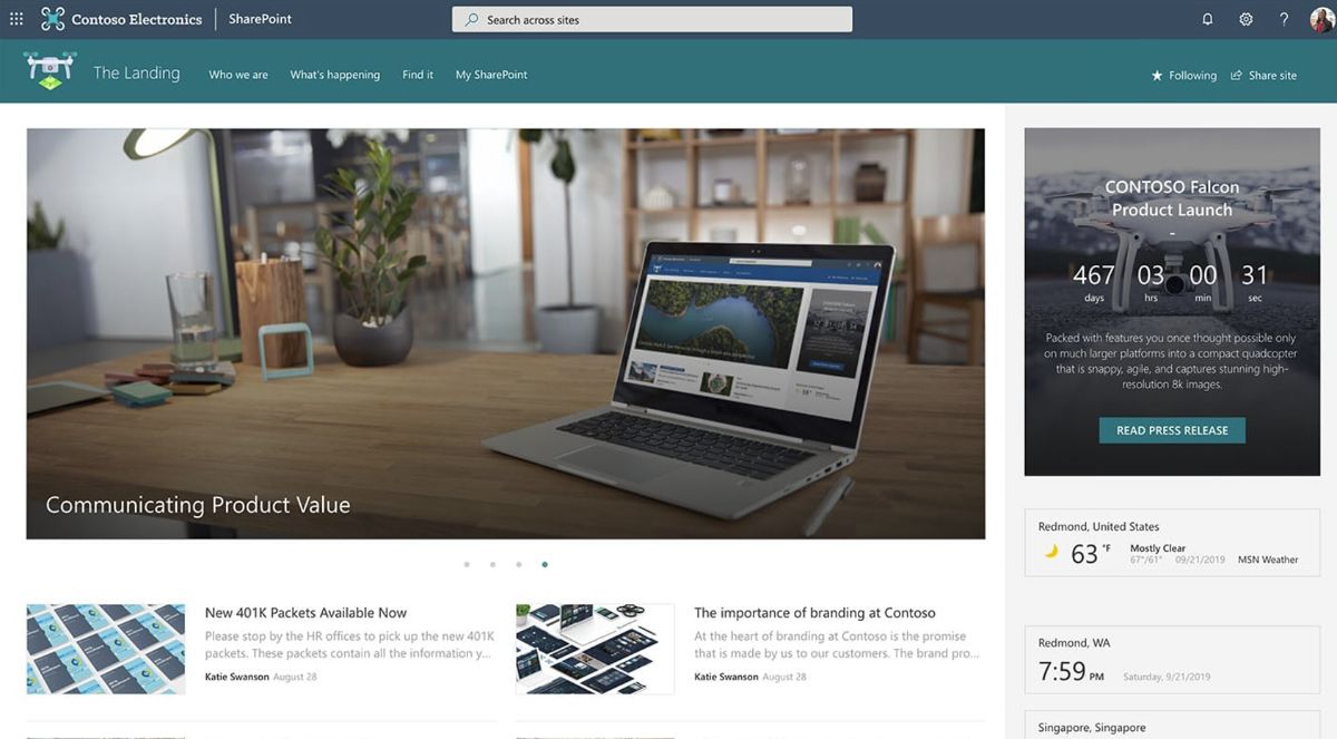 "The Landing" is a communication site built to serve as the central hub for employees seeking news, resources, and personalized content. It's designed to cater to the diverse needs of an organization's workforce, providing them with tailored information and tools to enhance their daily operations and engagement.
The site sports a custom company theme that mirrors the organization's branding, featuring a vertical section and section background for a clean and organized layout. Navigation is streamlined with a mega menu, and the compact header with a background complements the custom site logo and footer, creating a unified look and feel.
To facilitate information sharing and employee engagement, the site utilizes various web parts. The News web part is available in carousel, side-by-side, and list formats to showcase company updates in a dynamic manner. Quick Links in a filmstrip layout offer easy access to essential resources, while social integration is achieved through Twitter and Yammer web parts for live conversations and updates. Visual appeal is added with Image and Text over image web parts, and a Countdown timer, Weather, and World clock web parts provide practical information at a glance. Recent documents and Sites web parts in a compact layout ensure important documents and related sites are readily accessible. Highlighted content is displayed in a grid format for emphasis.
This template generates a demo structure for the home site of the portal, including a custom welcome page structure, 6 additional sample modern pages, and news articles, complemented with sample images and Office documents. This setup not only enriches the user experience with a variety of content and functionalities but also ensures employees have a go-to place for everything they need to stay informed and connected within their organization.
SharePoint Site Example #11: Freelance Communications Site
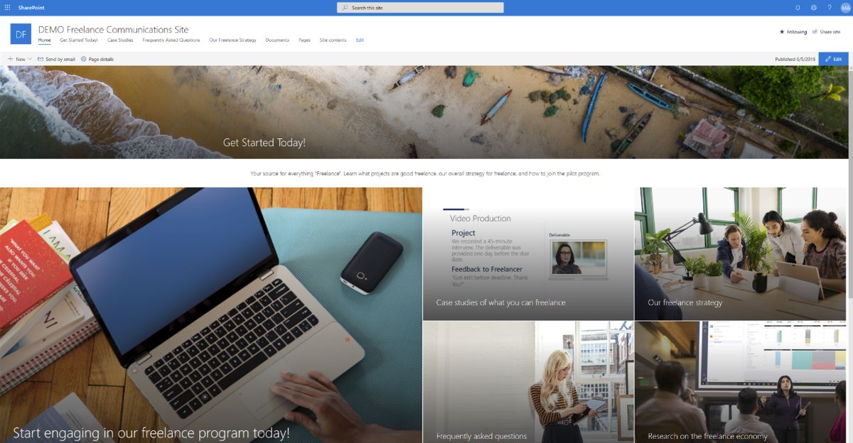 This Freelance Communication SharePoint intranet example is designed to support organizations working with freelancers or managing a freelancer program. It acts as a central hub for driving awareness, fostering engagement, and facilitating the flow of communication between internal stakeholders and freelancers. This SharePoint Online communication site template can be installed and customized within your organization to kick-start your freelance program efforts, offering a unified space on the intranet for your team, department, or division to collect and monitor data, stay informed about news, tasks, and deadlines, and access all necessary resources across Office 365.
The template is packed with resources to quickly bring your employees up to speed on freelance initiatives and projects. It provides a single intranet location equipped with FAQs on working with freelancers, best practices for engaging with external talent, case studies, and research on industry trends in the gig economy, including how concerns related to the gig economy are being addressed worldwide.
Site features include a compact header and a custom site logo for a personalized touch. Web parts utilized in this template include Text with custom RTE formatting, a Hero web part with full width and 5 tiles for highlighting key information, a File viewer with custom slide start for displaying documents, an Image web part with text overlay for visual storytelling, and an Embed web part with resize functionality for integrating external content.
Upon deploying this design to your SharePoint tenant, it establishes a new site collection using the communication site template, featuring a custom welcome page and 5 additional content pages. It also includes a sample PowerPoint file in the Documents folder and sample image content used throughout the template, ensuring a comprehensive starting point for organizations to effectively communicate and manage their freelance program initiatives.
SharePoint Site Example #12: Branding Site
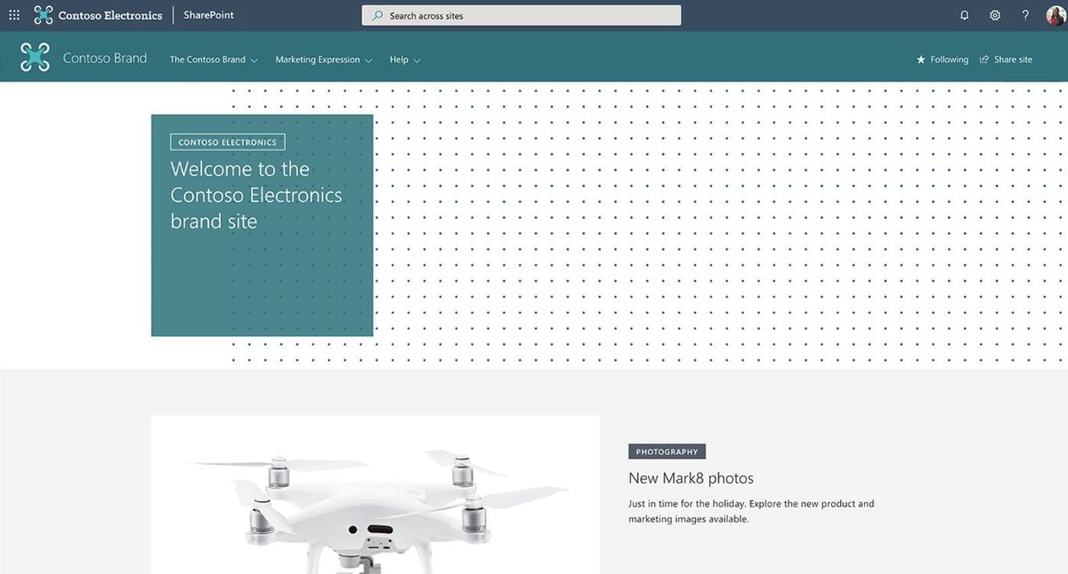 This Branding Site intranet example is designed as a key resource for employees, providing access to company brand guidelines and assets to ensure consistent branding across all deliverables. This site supports employees in applying the correct branding elements in their work, fostering a unified corporate identity.
Featuring a custom company theme, the site incorporates a vertical section and section background for a visually appealing layout. A mega menu enhances navigation, while a compact header with a background complements the custom site logo and footer, reinforcing the brand's visual identity.
To present content effectively, the site utilizes several web parts: A Hero web part with full width and 2 tiles prominently displays major brand elements or announcements. The News web part is available in carousel, side-by-side, and list formats to share updates or guidelines. Image and Text over image web parts allow for the integration of visual brand elements alongside descriptive content. Custom RTE formatting in the Text web part enables the creation of detailed guidelines with custom styling. A left-aligned Button web part facilitates easy navigation to important resources or actions.
Upon integrating this design into your SharePoint tenant, a custom welcome page is created to showcase the capabilities of different web parts, along with 3 modern additional pages. This setup equips employees with the necessary tools and information to maintain brand consistency in their projects, contributing to a cohesive corporate identity.
SharePoint Site Example #13: Charitable Site
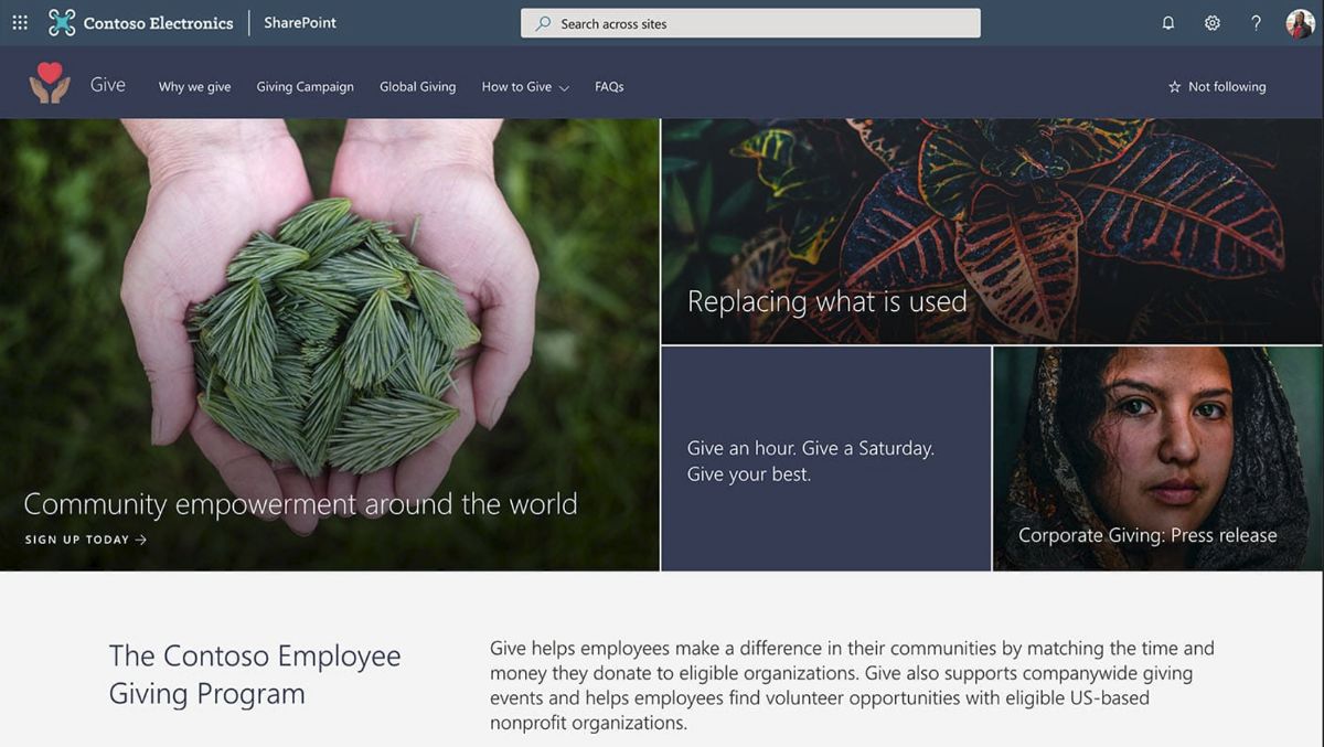 The Charitable Site template is a SharePoint communication site designed to showcase your company's giving program. It provides information on the program, including news, calls-to-action, metrics, and inspiring stories to encourage participation and awareness.
This site employs a custom company theme complemented by a section background, enhancing the visual appeal and making the content more engaging. Navigation is facilitated through a mega menu, and the site's appearance is unified with a compact header with a header background, a custom site logo, and a footer.
Key web parts used include a Hero web part with full width and 4 tiles for highlighting major initiatives or stories. Text web parts allow for custom RTE formatting, enabling detailed descriptions and stories to be shared effectively. Buttons are included for calls-to-action, with options for left and center alignment to draw attention to specific actions users can take. Images paired with text provide visual context to the content, making it more engaging. Another Hero web part features 1 column 1 layer, full width with 1 tile for a prominent display of significant messages or campaigns. News is presented in a side-by-side layout to keep viewers informed of the latest updates and stories.
By adding this design to your SharePoint tenant, a custom welcome page is created using out-of-the-box web parts. Additionally, 2 articles with example content and 4 news articles are included to demonstrate the site's capabilities and provide a foundation for your charitable program's online presence.
What's the Easiest Way to Build a SharePoint Intranet Site?
The easiest way to create your own SharePoint intranet site is by using templates from Microsoft's "lookbook". To get started, just visit Microsoft's lookbook, find a template you like and click "Add to your tenant" and you'll have your own intranet site set up in a few minutes (instead of spending days creating your own from scratch).
Otherwise, you can view the hand picked templates we have above, that are highlights from Microsoft's lookbook.
Conclusion
I hope you found these examples inspiring. Maybe one was perfect to use as a template to build your intranet site.
If you didn't find one here, go ahead and check out all of Microsoft's official examples at Microsoft's lookbook.
You're bound to find an example intranet site there that you can use.
Thanks for reading! If you have any questions or comments, use the comment section below.


