What's the Right Google Sites Banner Size? [With Screenshots]
![What's the Right Google Sites Banner Size? [With Screenshots]](https://foyercus.blob.core.windows.net/287a2408185e68c371c/blog/78/c/23ecd55b-1317-483f-89fa-7f07bb4591e6.jpg)
![What's the Right Google Sites Banner Size? [With Screenshots]](https://foyercus.blob.core.windows.net/287a2408185e68c371c/blog/78/c/23ecd55b-1317-483f-89fa-7f07bb4591e6.jpg)
Are you setting up a Google Site, but can't figure out the right Google Sites banner size? Don't fret!
In this guide, I'll show you how to pick the right size for your Google Sites banner so you can amaze your visitors with that enthralling image for your landing page.
First, let's go over a common point of confusion surrounding Google Site's terminology.
When people refer to a Google Sites banner might mean two things. Either the "announcement banner" that can appear at the top of each page, or the site's header banner where you can set the cover image (e.g. for a landing page).
If you're looking to set the Google Site banner size, then you're looking for how to set what's called the "page header" banner.
I'll go over exactly what the banner is in Google Sites, what the best size image to use is, how to set the header banner image, and why you might want to consider inserting an image instead of using the banner.
Looking for a quick and easy way to create a website, that's similar to Google Sites? Try out Foyer's site builder! All you need to do is pick a template, and your site will be ready to use in under one minute. |
|---|
What is the Banner in Google Sites?
In Google Sites, there are two things called the "banner". That is: the announcement banner and the page header banner.
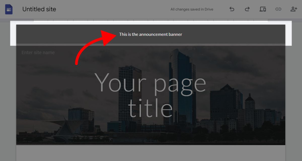
The announcement banner is the optional message that can be displayed at the top of every page. Banners are used for alerting visitors of your site about a high priority event, or for providing them with a call to action. See the screenshot below for an example of a banner in Google Sites.
Whereas the page header banner is the area behind your page's title where you can add an image or set the background color. See the screenshot below for an example of a page with a regular sized header banner.
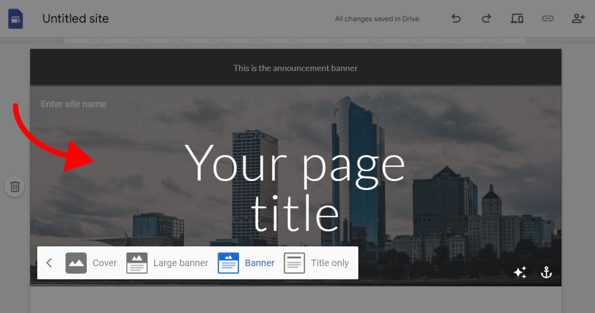
Depending on which size banner you choose (e.g. cover, large, or regular) for the header banner, your background image will take up more of the page.
You're probably wondering: which size banner should I use for each type of page header?
But, before we get into that, let's talk about the problem you're seeing in Google Sites.
Why Does Your Google Sites Banner Not Fit?
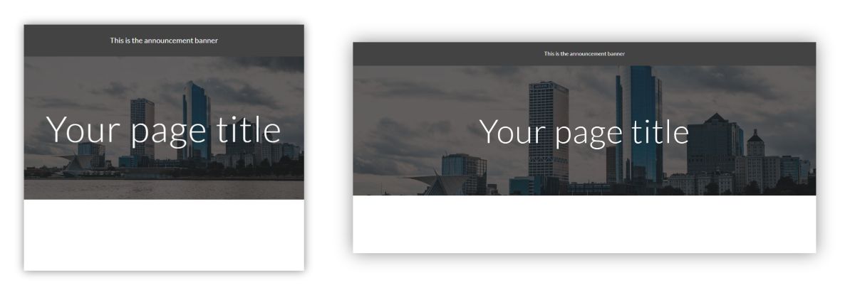
You might notice that part of your Google Sites banner image is hidden off the page, as if the image is overflowing off the page.
Check out the screenshot above for an example of the same Google Sites page viewed on a smartphone (mobile) on the left and on desktop on the right. Notice how the height of the image is getting clipped or hidden, and the tallest building appears to be overflowing off the page on the right.
This behavior is actually by-design. It is just a reality of how Google Site's banner images work.
Google Sites uses an image fit called "cover fit" which is great for responsive websites (when you need a website to work on any device), but not great for showing specific content in an image.
The benefit is that you can throw just about any image in as your banner image, and it should work. The problem is it is unpredictable to line it up with your text, or to be sure that the key parts of your image don't overflow off the page.
Looking for a quick and easy way to create a website, that's similar to Google Sites? Try out Foyer's site builder! All you need to do is pick a template, and your site will be ready to use in under one minute. |
|---|
What Size Should the Google Sites Banner Be?
Your Google Sites banner image can be any size and aspect ratio. All you need to do is make sure your banner image is a high quality image, and if you run into overflow problems, adjust it via anchoring or insert an image instead.
We have a comprehensive section on how to use anchoring later in the guide, and in the next section we will cover when you should just insert an image instead of using the banner image.
But, if you want some indication from Google on what banner size to use, their Google Site templates use banner images that are 1600 pixels wide by 1068 pixels tall (1600 x 1068).
This doesn't mean you need your banner image to be exactly those dimensions.
It is important to note that part of your image will always be hidden or clipped when using a banner image.
This is just the nature of how the banner image works, because of the support for all sorts of devices (e.g. phones, tablets, desktops).
If you need to make sure your image isn't clipped, you should insert an image insert of using the banner.
When to Insert an Image Instead of Using a Banner
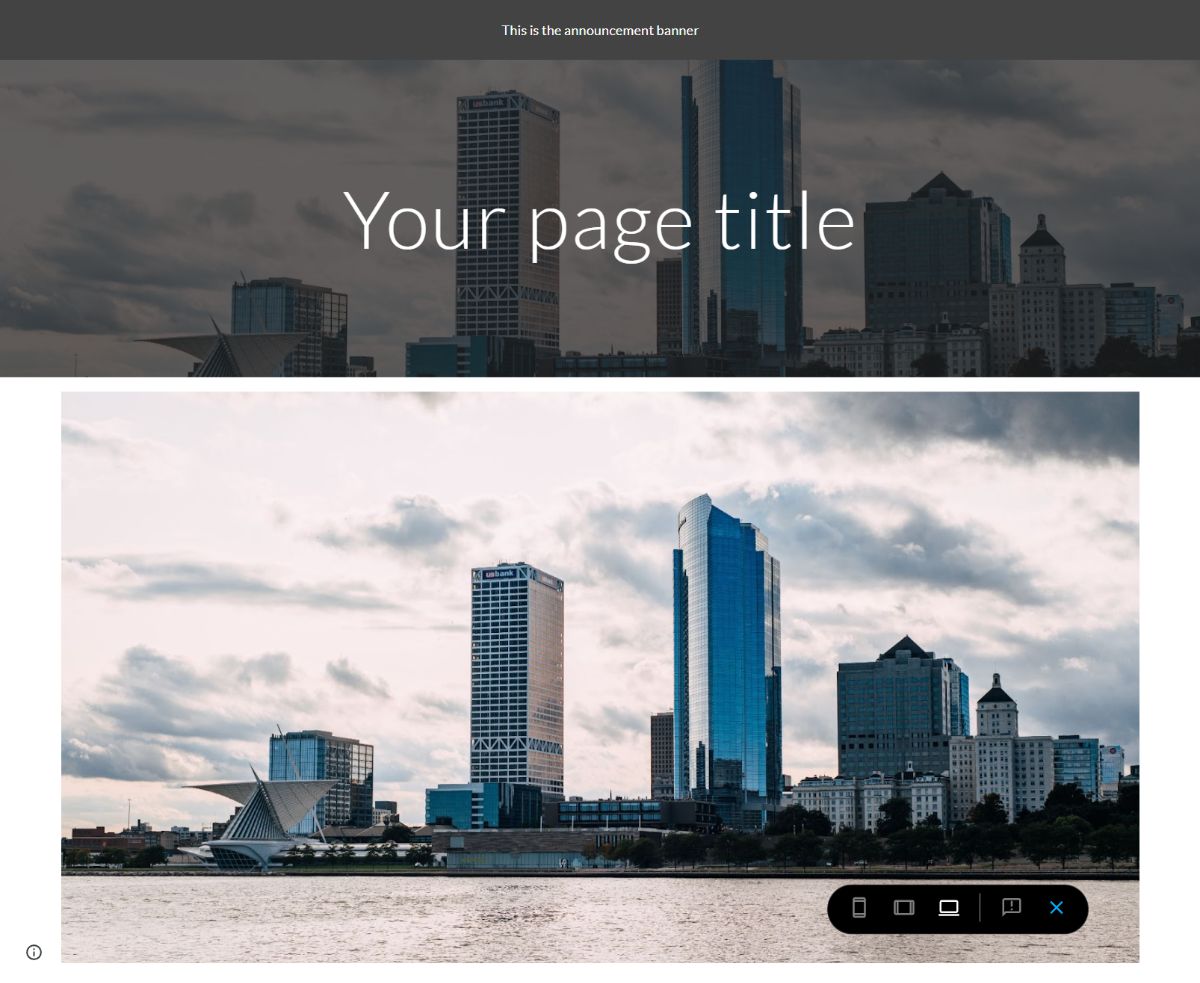
In the screenshot above, you'll see the difference between the banner image (on the top of the page) and inserting an image (bottom).
Notice how the inserted image is shown in its entirety (you can see all the water and sky), but the banner image is clipped and missing most of the picture.
There is no guarantee that your whole image is going to be shown in the banner in Google Sites. Because of the way images or scaled for different devices (like mobile phones, tablets, and desktops), there will always be part of your banner image that gets clipped or hidden.
If you need your entire image to be shown, your best bet is to just insert a image instead of using the Google Sites banner.
You'll want to insert an image instead of using a banner image for any one of these cases:
- You have text within your image that you want to show
- There is some critical part of your image that cannot be missing
Some people suggest trial and error to size your banner image for different size devices. That is something you can try, but likely will be a lot of work and might not cover all your device sizes. The best option is just to insert the image without using the banner that way it is guaranteed to show the entire image.
How to Anchor Your Google Sites Banner Image
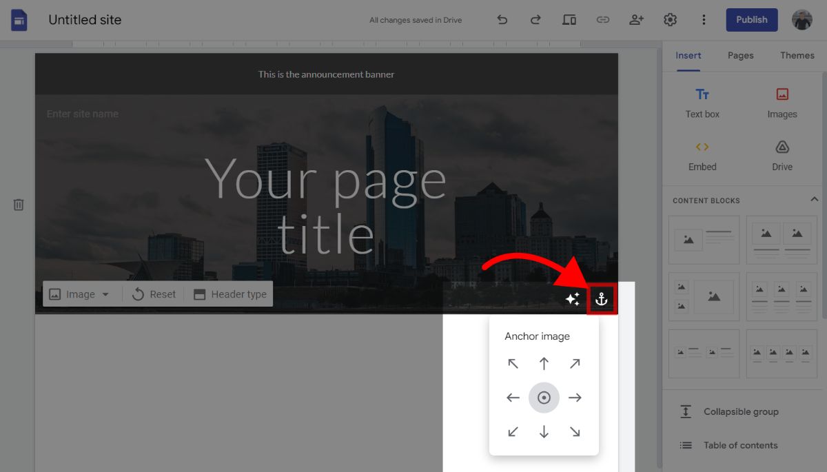
It can be tricky to get your header banner image to line up with your texts. Often times, you'll run into an issue where your text hides some important aspect of your banner background image.
If that's the case, there are two remedies. First, you can align your text to avoid overlapping with a part of the background image. For example, in our screenshot above we could try to move the "Your page title" header text to the left to avoid obfuscating the city scape in the background.
However, if part of your background image is constantly getting in the way, or it doesn't look like it is positioned correctly, you might just need to "anchor" it.
In the screenshot above, you'll see that there is an anchor button you can press (while hovering your mouse over the header) that will allow you to position your background image to any direction, including the default which is to center it.
Anchoring the banner image is necessary because of the way Google Sites displays banner images. They fit your image as what is know as a "cover" image in web design. A "cover" image fit is when an image is restricted to some container with certain size constraints, but free to expand beyond the container.
Google Sites does this with the large and regular banner images. Their banner images can have a fixed height, but a unrestricted width. This means any additional width will be hidden off of the page. That's why when you resize the screen, you'll notice parts of your banner image being clipped and hidden.
Anchoring your banner image can be a way to choose which part of the image will be clipped first. For example, if you anchor to the left, the right portion of the banner image will be clipped first (instead of the left side).
To set the right anchor position, consider what the most important section of your image is, and how it interacts with your header text. To test out an anchor position, you need to set the position, and then resize your screen to test how the banner image behaves as it overflows.
Looking for a quick and easy way to create a website, that's similar to Google Sites? Try out Foyer's site builder! All you need to do is pick a template, and your site will be ready to use in under one minute. |
|---|
How to Set the Google Site Banner Image?
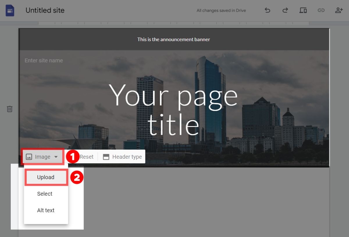
Setting your Google Site banner image is easy. All you do is hover over your page header, and locate the "Image" option on the bottom left.
Click on it, and select the "Upload" option to pick a file from either your local computer or from another source like Google Drive.
You can also edit the alt text there which is an important step when considering accessibility (for screen readers), and for improving your rankings on search engines.
How to Insert an Image in Google Sites?
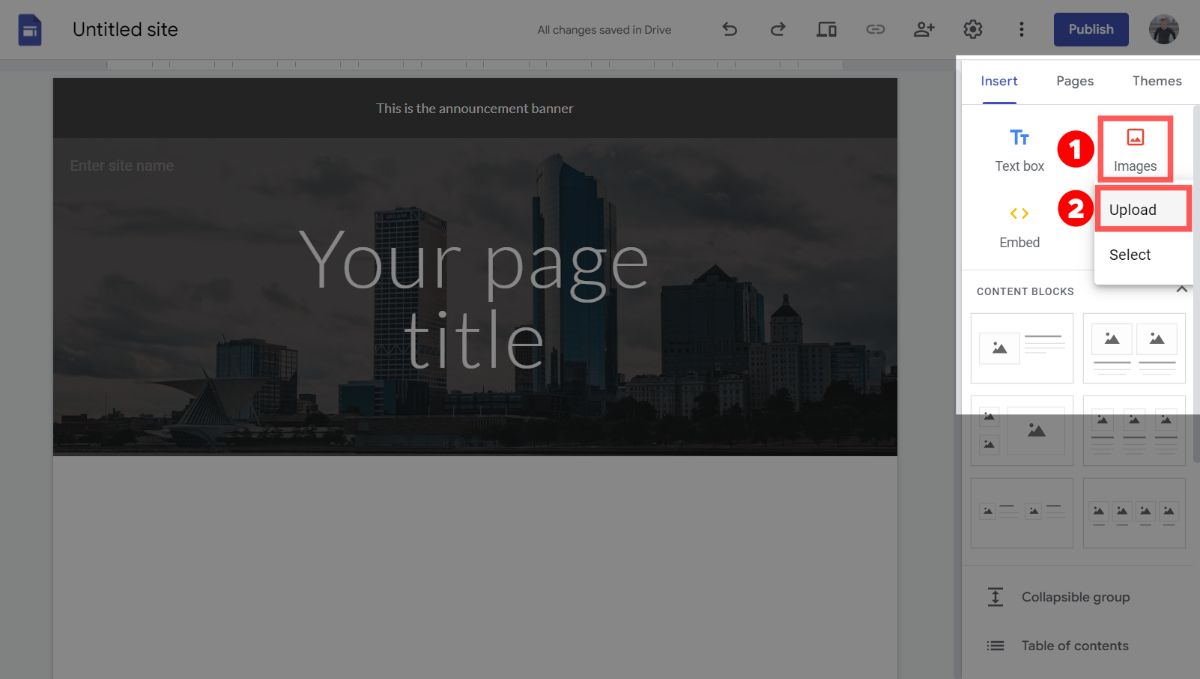
To insert an image in Google Sites, first pick where you'd like the image to go. You can do this by clicking on the section.
Then, in the right drawer, make sure you're on the "Insert" tab. Then click "Images", in the dropdown menu select "Upload".
From there, you can select an image either from your computer, or from external storage like Google Drive.
How to Change Header Type in Google Sites?
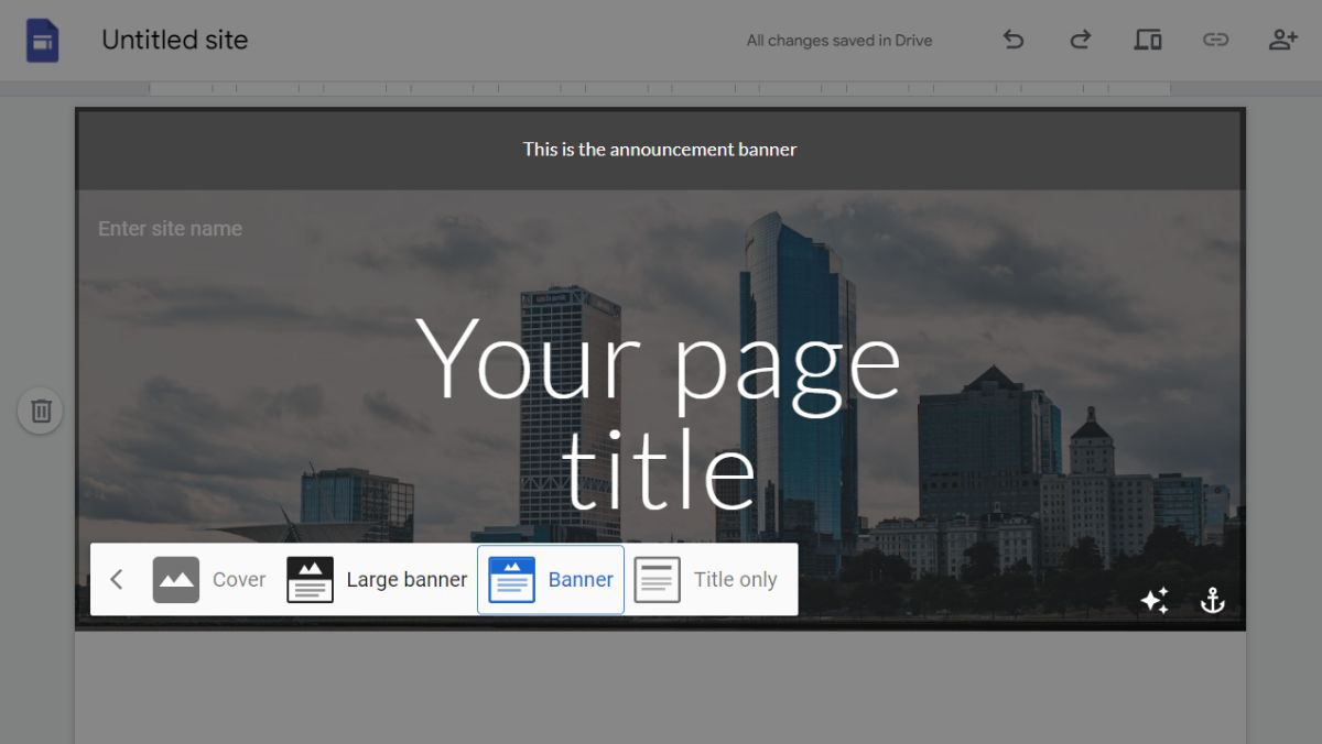
The header type in Google Sites controls what the top of your page looks like. It can be used from anything from a basic text header to a beautiful cover image.
There are 4 header types that Google Sites supports:
- Cover
- A full screen image with text over it
- Large banner
- A large full width image with text overlayed
- Banner
- A smaller fill width image with a title overlayed
- Title only
- A text-only title
To change your header type, just click on the header you want to change. On the bottom left of the header, you'll see a popover box that has an option called "Header Type". Click that option, and you'll see a screen similar to the screenshot above.
From there, you can choose whichever header type you want, and the changes will be automatically reflected in your Google Site. Experiment and see which one works the best for you!
Best Client Portal for Google Sites: Foyer
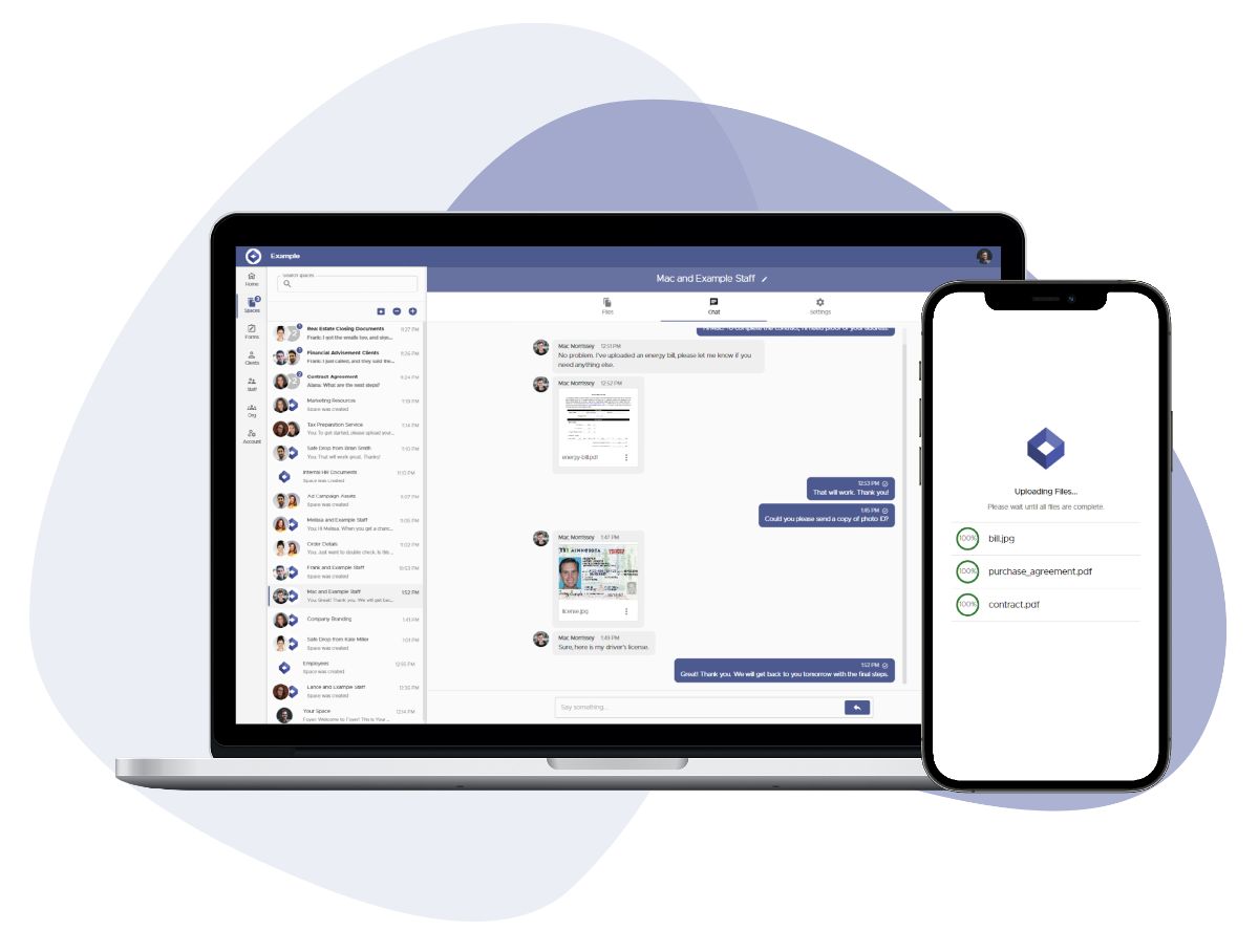
If you're looking for a client portal for your Google Site, I strongly suggest using a dedicated client portal like Foyer.
Foyer is low cost ($19 per month per internal user) and includes every feature you'd need out of a client portal. It can be integrated into any Google Site via a link or a direct embed.
You can even try it out for free without a credit card. Onboarding to Foyer is quick (takes 1 minute) and their support will help you migrate any existing data you have.
Here's a list of some of Foyer's features:
- Secure file sharing with clients
- A secure messenger to send clients encrypted messages
- Email and desktop notifications for all portal activity
- Audit trails for every action (login, file download, file upload, etc...)
- Client multi-factor authentication (MFA/2FA) support
- Requesting e-signatures from clients
- Custom forms to collect specific client information
- Secure email via Microsoft Outlook
- An internal knowledge base builder to share internal business documents and trainings
- Desktop and mobile support
Foyer is the perfect fit for Google Sites, because it is affordable and with all the features you get, it has bang-for-buck just like Google Sites!
I hope this guide helped you set a size for your banner image. If you have any feedback or suggestions please let us know by sending a comment below. Thanks for reading.


